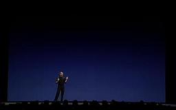
 Presentation Zen has a great post comparing the PowerPoint styles of Steve Jobs and Bill Gates. More than poking fun at poor, awkward Bill, the comparison really makes the point that PowerPoints must (1) complement the speaker, and (2) look different to audiences. People have sat through so many PowerPoint presentations that they despise the typical templates and bullets. However, audiences are also so accustomed to multimedia presentations that the "no powerpoint" approach can be even more risky (TWIT had an interesting discussion on this topic during last week's show). Presentation Zen emphasizes that the speaker should use PowerPoint to enhance a natural, relaxed presentation. The PowerPoint should never be a crutch to lean on.
 Presentation Zen has tons of pointers and plenty of helpful links. If you regularly have to do PowerPoints or think you may need to in the future, consider subscribing to their feed.
Also, check out these excellent presentation posts from Particle Tree and Michael Hyatt.


2 comments:
Also a very cool presentation:
http://www.identity20.com/media/OSCON2005/
Very interesting article, thanks for posting.
Iklan Baris Gratis
Peluang Bisnis
Bisnis Pulsa
Pasang Iklan Baris
Iklan Gratis
Pasang Banner
Post a Comment